Four Tips When Using Graphics in Your Proposals
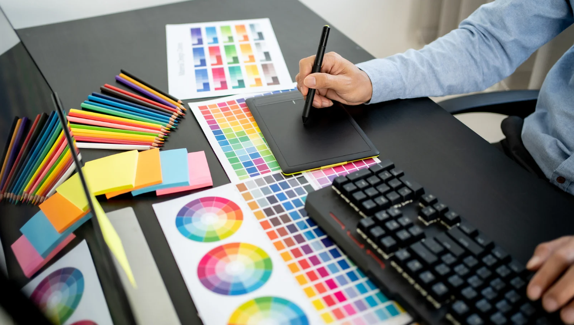
If you have great graphics in your proposals, your readers and reviewers will thank you. Instead of giving your readers pages of text to read, create tables, charts, images, or other graphics to make it as easy as possible for your audience to understand the information you are presenting in your proposals. Before you start using clip art, we've got a few suggestions on how to get the most bang for your buck in your proposal graphics.
Tip 1: Keep it Simple
If it takes your reader longer than a few seconds to look at and understand what you are trying to convey in your graphic, then you will lose your reader. Keep it simple. Proposal covers don't have to have a variety of images and graphics, sometimes a compelling single image can do the job. Limit the color palette and number of fonts. Just keep it simple.
Tip 2: Make Sure It's Relevant
Your graphics must be relevant to the subject matter. I once had an extensive argument with a project executive because he didn't understand why I had pictures of college students on the front cover of a construction services proposal. A large majority of the RFP specified how important student safety was to the overall success of the proposals. In addition, at the pre-bid meeting, more emphasis was placed on the students and student safety. Although we were a construction company, we were doing the work on a very busy college campus, and the end-users were the students and staff. I felt it was important that we communicated through the cover are that we were aware of who the end-users were and how important it was that we kept them safe. In other portions of the proposal, I included photographs of our construction team, but I thought it was more important to make sure the review staff understood that we knew their students and staff were our clients as well.
Tip 3: Useful and Focused
When you incorporate tables or graphics in your proposals, make sure they are useful. Organizational charts are a good example of a useful graphic as well as project schedules and process maps. Remember, selection committees have to read thousands of pages and try to remember details about each team. Make it easy for the selection committee to remember you by creating graphics that are useful and help them easily absorb the information in your proposal. In addition, graphics included in your proposal should be more than just "pretty." Your graphics should be focused and represent the information the RFP requests.
Tip 4: Action Captions
Make sure you make the most of your relevant images by adding great captions that describe what is happening in the image. In APMP's Proposal Writing for Dummies, the authors encourage the use of "action captions." Action captions are, "One complete sentence that explains the relevance of the graphic to the evaluator, linking benefits to features. The simpler you can make an action caption, the better." Or even better, what if in the action caption after the sentence, you had a link that took the evaluator to a microsite that featured a short video giving more context to the image on the page?
Envisioning Success
Graphics are a great way to give your readers less text to absorb and help your proposal stand out from your competition. Make sure you use relevant graphics, tables, and images to reiterate key points in your proposal. Keep your graphics focused on answering the questions asked in the RFP, and use captions to describe what your images are depicting. If you can create a great balance between text and graphics in your proposal, your team will be one step closer to the shortlist presentation.